
I joined Rent the Runway in 2019 to help build a new subscription tier to add to their product portfolio. From emails, how it works pages, the entire site and app experience, and even internal tools, I was involved in determining every part of the user journey. Here are some highlights…
Rethinking the Funnel
Renting clothing isn’t a concept that most folks are familiar with, which makes clarity in the experience all the more important. The non-member version of the RTR site used to be a bit of a Choose Your Own Adventure approach, which led to lots of potential user dropoff.
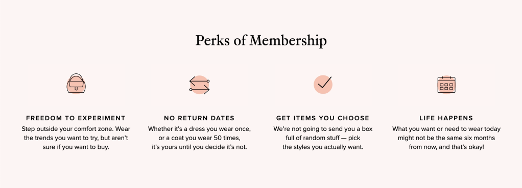
Many members were joining without fully understanding the program, which led to high churn rate, and high CX volume. I focused on getting clear user benefits highlighted early on, as well as some basic program mechanics.
Working closely with the Growth team to evaluate all pre-acquisition placements, we tested and launched improvements that gave a clearer path for new users to take:
- Learn a bit about subscription 2. Pick the plan that’s right for them 3. Sign up
Creating the subscription landing page led to a 35% lift in conversion for one subscription tier an incremental 8% conversion lift overall. A huge win for the business and user comprehension. A win-win.
Permanent placements for User Education
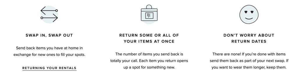
Historically RTR had relied on email communications to explain everything. The emails were long, confusing, and likely not read completely by new members. I pushed to remove the crucial membership logistics from deep in members’ inboxes and give them a permanent home on the site. Enter the Swaps and Returns pages.
It was important to me that if someone were searching online for “rent the runway how to return” or “how to swap” they could find information from us, on our site, and not have to dig through their inboxes. Both of these came together quickly and were created in just a few days using existing CMS molecules.
Since swapping is confusing to those that are new to renting, I wanted to make it seem as simple as possible. My goal here was that someone could consume this whole page in 2 minutes or less and get their questions answered, regardless of which membership type they chose. This page got thousands of views within the first few days it was live, validating my belief that it was needed!
All-New Emails
Building a new subscription tier meant that every. transactional. email. had. to. be. redone.
It was a months-long process involving the Design, Creative, Email, and Product Marketing & Consumer Strategy teams, but it all started with a humble Google Doc. I edited the hell out existing emails, paring down the content to a reasonably readable length. Then, worked with Design to create reusable templates and patterns that matched the new in-app experience. The visual consistency felt like a huge improvement.
One more fun thing I got to add in was a new element we called “RTR TIP”s. They act in a balance of excitement and education, to help new users feel like they’re equipped to get the most value out of their membership.

Could honestly probably talk about these emails for 4-6 hours, so if you want to attend my private TED Talk on the subject, just ask!
