
At Namely I helped make complex HR tools more usable. Digging into HRIS, payroll, performance reviews and more, I gained a lot of empathy for those that help make things run at a company. Since these systems were so complicated, we as a design team tried to sneak in lots of small improvements where we could.
Imagine this: You’re a payroll admin. You spend hours, days even, making sure that every hour for every employee at your company is accounted for, all benefits are being deducted correctly, among hundreds of other things. You finally hit the big submit button, and then you’re greeted with the following screen.
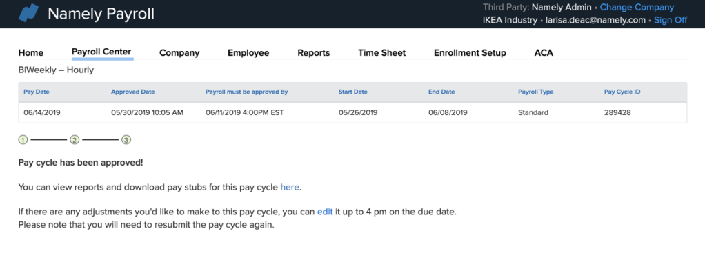
While technically this screen is doing its job. It’s not very visually appealing, and it’s not very readable. Without removing any of the information from this screen, I proposed a simple reformatting and the addition of a visual, and here’s where we ended up.
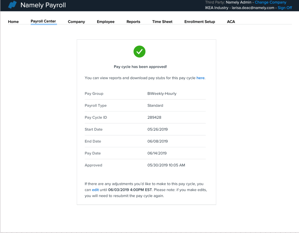
Is it still a lot of number jumbles and dates? You bet. But does it feel less overwhelming and almost pleasant? Also yes. (I love the cute little green check!) Giving the confirmation messaging an updated visual treatment helped highlight the clarity of a successful submission, without overdoing it.
